

23 Summer Square Nail 2026: Trendy Square Nail Ideas I’m Saving for My Next Manicure
I’ve been scrolling through so many square nail inspo boards lately, and I finally decided to round up the ones I genuinely can’t stop thinking about. Square shapes have this way of making every color feel a little more intentional, the flat, clean edges give even the softest pastel a sense of structure that rounder shapes just don’t offer. This roundup covers everything from botanical greens to bold chrome finishes, basically every mood I’ve caught myself craving this summer. If you’re someone who screenshots nail photos and never actually books the appointment, consider this your sign to finally follow through. I’m saving every single one of these for my next salon visit, and I have a feeling you will too.
What I love most about square nails specifically is how differently the same design can read depending on length and finish. A soft lavender ombre feels totally different on a short square shape than it does on something longer, and chrome finishes seem to catch light in a way that flatters those sharp corners especially well. My nail tech has been experimenting a ton this season, mixing textures I wouldn’t have thought to pair together and pulling inspiration from everywhere, European minimalism, old Y2K throwbacks, even little botanical sketches. There’s honestly a design here for whatever mood strikes you walking into the salon. Let’s get into the ones sitting at the top of my list.
Green Botanical Nails With Fresh European Vibes
There’s a specific kind of manicure you see all over European nail accounts, understated, a little earthy, always featuring some tiny hand-drawn plant detail tucked into the corner of the nail. This design nails that exact energy, pairing a soft sage or olive base with delicate leaf sketches that look almost like they belong in a botanist’s notebook. Nothing about it feels loud or overdone, which is precisely why it photographs so beautifully against a plain outfit or a stack of gold rings. I keep coming back to this one because it feels like the kind of manicure that never actually looks dated, even a year from now.
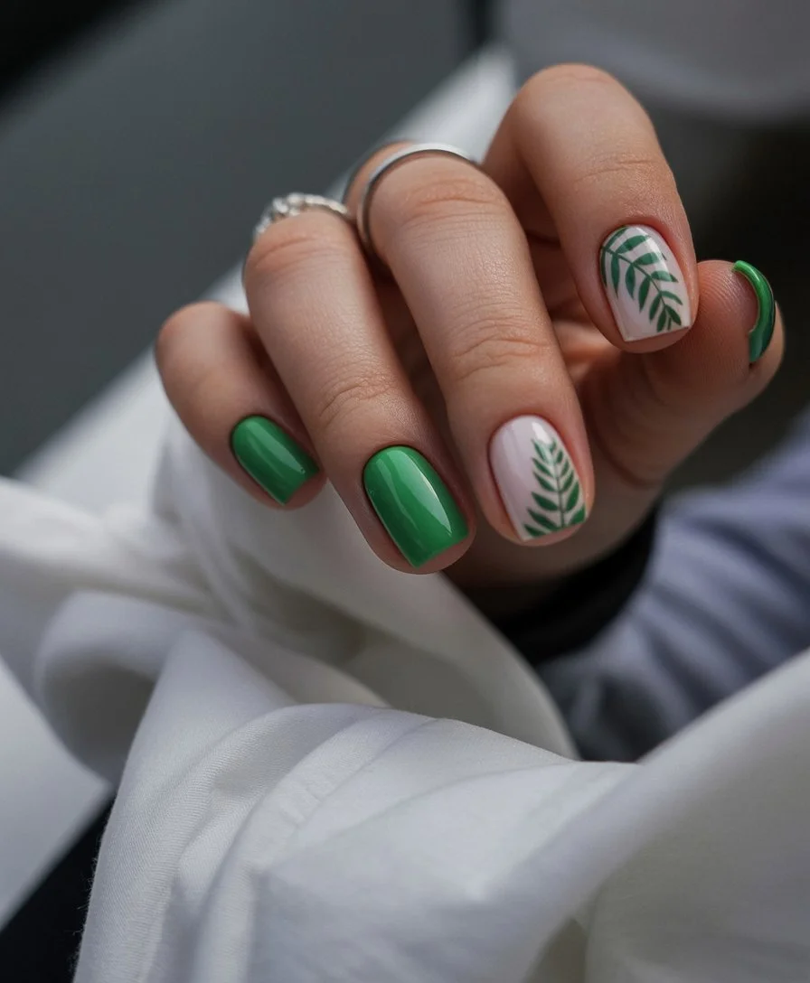
Getting the base right starts with a smooth, muted green polish, something closer to sage or fern than a bright kelly green, applied in two thin coats to keep the color soft rather than heavy. Once that’s dry, a tiny brush comes in for the botanical detail, usually a couple of simple leaves or a thin stem sketched onto just one or two accent nails rather than the entire set. Keeping the linework loose and slightly imperfect actually helps here, since anything too precise starts looking stamped instead of hand-drawn. A glossy finish seals everything at the end, giving the muted green a bit of shine without pulling focus from those quiet little sketches.
I’d wear this with linen pants and basically anything neutral, since the whole point is letting the nails feel like a subtle detail rather than the main event. It works just as well running errands as it does at a slower, café-hopping kind of weekend. If you’re drawn to that quiet, put together European aesthetic everyone keeps talking about, this is honestly one of the easiest ways to bring it into your own routine.
Hot Pink Ombre Nails For Peak Summer Energy
Some colors just scream summer, and hot pink sitting at the peak of a smooth gradient might be the loudest example on this whole list. This design starts soft near the cuticle and builds into a fully saturated, almost neon pink by the tip, giving the whole nail a sense of movement a single flat color never quite achieves. It’s confident without needing any pattern or extra detail, the fade itself carries all the personality. I love how something this simple in concept can still end up looking so dynamic once it’s actually on the nail.
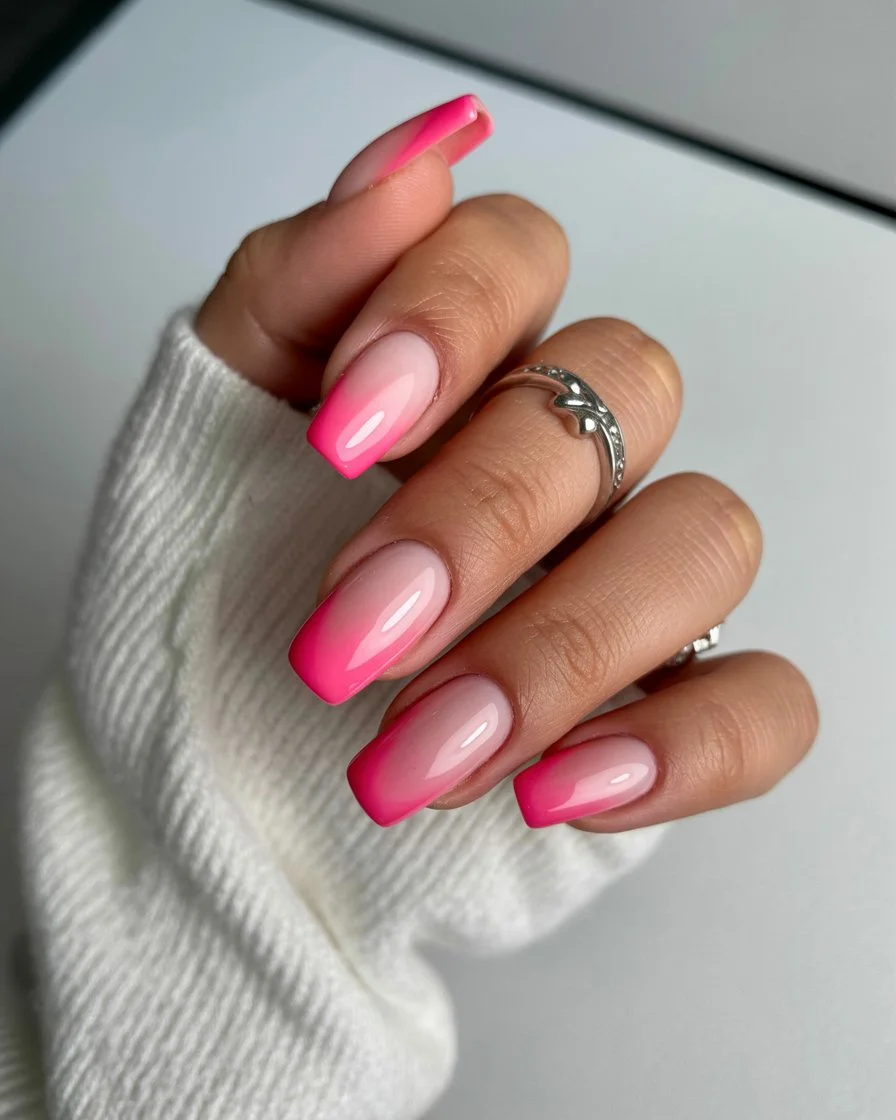
Building the gradient starts with a pale pink or white base, giving the deeper pink something bright to build against as the color intensifies toward the tip. Using a makeup sponge, a fully saturated hot pink gets dabbed on gradually, starting light near the middle of the nail and layering more heavily as you work toward the edge, blending the transition with a few gentle sponge dabs so it doesn’t read as two separate blocks of color. Patience matters here more than skill, since rushing the blend tends to leave a visible line instead of that soft, gradual shift. A glossy top coat finishes things off, making the deepest part of the pink look genuinely electric under sunlight.
This one pairs beautifully with basically anything white or neutral, letting the gradient handle all the color work on its own. I’d reach for this before a beach trip or really any event where I want my hands doing a little bit of the talking. It’s bold, but not in a way that ever feels like too much.
Mint French Tips That Feel Like A Cool Summer Morning
French tips have had such a fun reinvention lately, and this mint version might be my favorite update so far. Instead of the traditional white line, a pale, almost icy mint takes over the tip, keeping that classic silhouette intact while giving it a completely different mood. It reads as fresh and a little unexpected, the kind of color that feels appropriate for practically any summer plan without ever looking like it’s trying too hard. Something about mint specifically just feels cool to the touch, even though obviously polish doesn’t actually change temperature.
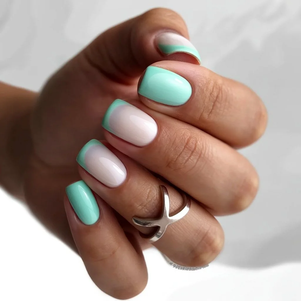
The base stays sheer and natural, a soft pink or nude painted across the whole nail just like any classic French manicure would call for. At the tip, a pale mint gets applied in smooth, deliberate strokes, and honestly getting that curved line crisp is really the only tricky part of the whole process. Guide stickers help a lot if your hand isn’t steady, though a thin brush works fine once you’ve had a bit of practice. Two coats usually gets the mint to full opacity without looking streaky, and a glossy top coat afterward gives the tip that clean, polished shine French manicures are known for.
I’d pair this with pretty much any casual outfit, denim, linen, even a simple white tee, since the color feels versatile enough to match without much thought. It’s a great pick for anyone who wants something that reads as put-together for work but still feels distinctly summery. Honestly this might be the design I end up requesting most often once I actually get to the salon.## Butter Yellow Nails That Feel Like Summer Sunshine.
Minimal White Nails With Crystal Details
There’s a certain elegance to a manicure that barely does anything at all, and this design leans fully into that idea. A soft, semi-sheer white covers the whole nail, quiet and understated on its own, until a couple of tiny crystals get added near the cuticle for just a hint of sparkle. It’s the kind of look that feels expensive without actually requiring much effort, restraint really is the whole point here. I love how something this minimal can still feel special the moment light catches those little crystal accents.
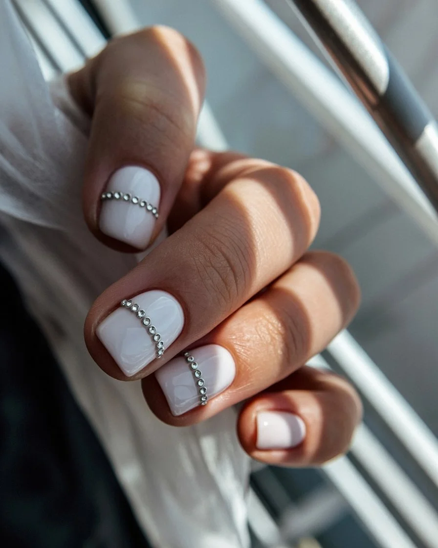
The base starts with a sheer, milky white polish, built up in thin layers until it reaches that soft, slightly cloudy opacity rather than a stark, opaque white. Once that’s fully dry, tiny crystals get placed individually using a dab of nail glue and a pair of tweezers, usually just two or three per nail clustered near the cuticle rather than scattered everywhere. Keeping the placement sparse is honestly what makes this design work, too many crystals and it starts looking cluttered instead of intentional. A glossy top coat seals everything in around the crystals, careful not to dull their sparkle in the process.
I’d wear this with basically anything elevated, a linen dress, gold jewelry, sandals that feel a little more put-together than flip-flops. It works beautifully for weddings, dinner reservations, or really any occasion where you want your nails to feel polished without being the loudest thing in the room. This is one of those designs I keep saving because it never actually goes out of style.
Chrome And Neon Mix For Bold Summer Moods
This one is basically the opposite of restraint, pairing a fully reflective chrome finish with a punch of neon color for a combination that feels genuinely futuristic. Half the nail gets that mirror-like metallic shine, while the other half carries a saturated neon shade, usually pink or green, creating real contrast between texture and color. It’s a lot going on, but somehow it works, probably because both elements are confident enough to hold their own space without fighting each other. I keep coming back to this design whenever I want my nails to feel like an actual statement.
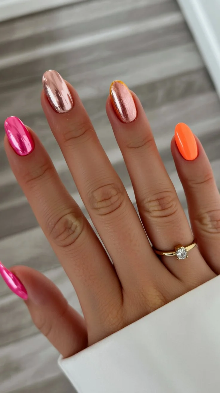
Getting started means deciding how the nail splits between chrome and neon, often a diagonal line across the middle rather than a straight vertical or horizontal division. The neon section gets painted first, using two to three coats of a fully saturated polish to reach maximum brightness before moving on. Once that’s cured, the chrome section gets prepped with a dark base coat, then buffed with chrome powder using a small sponge until it reaches that flawless, reflective shine. A glossy top coat ties both halves together at the end, unifying the finish even though the textures underneath couldn’t be more different.
This design pairs with genuinely bold outfits, statement earrings, anything that isn’t afraid of a little visual noise. I’d save this for festivals, pool parties, or any night out where I want my hands doing something nobody else’s are doing. It’s not subtle, but subtle was never really the goal with this one.
Pastel Blue And Green Nails For Fresh Summer Energy
There’s something about pairing pastel blue with soft green that instantly feels like the ocean meeting a garden, calm in a way that’s hard to explain until you actually see it on the nail. This design alternates the two colors across different nails rather than blending them together, letting each shade stay clean and distinct instead of merging into something muddier. It reads as fresh and easy, the kind of pairing that doesn’t need any pattern or extra detail to feel finished. I keep gravitating toward color combinations like this because they somehow feel more thoughtful than reaching for just one single shade.
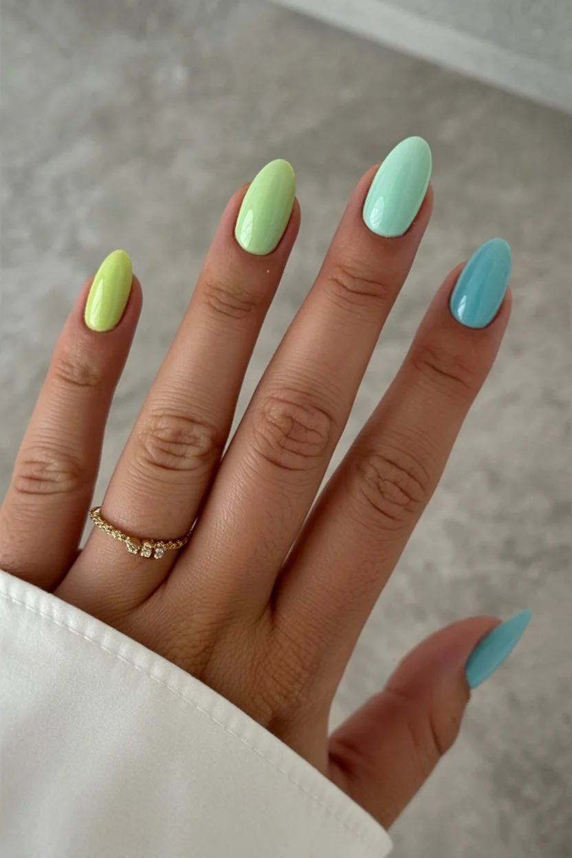
Getting even coverage on both colors takes roughly the same approach, two to three thin coats per shade, letting each layer dry fully before adding the next so nothing drags or streaks. Deciding how to split the colors across the hand matters more than it seems, alternating nail by nail usually looks more balanced than grouping the same color together on one side. Because both shades are pastel and fairly close in intensity, keeping the application clean really does matter here, any unevenness tends to show up more obviously against colors this soft. A glossy top coat finishes things off, tying the blue and green together with a consistent, polished shine across the whole set.
I’d pair this with linen or cotton pieces in white or sand tones, letting the pastel combo feel like the only real pop of color in the whole outfit. It works beautifully for garden brunches, beach mornings, basically any daytime plan that calls for something soft but still intentional. This is one of those pairings I didn’t expect to love as much as I do until I actually saw it finished.
Abstract Gold Waves With Soft Summer Glam
Gold detailing has a way of instantly elevating whatever it touches, and this design proves that point using nothing but a few loose, abstract wave shapes painted in metallic gold. Instead of covering the whole nail, the gold stays minimal, just a couple of sweeping curves layered over a soft, sheer base, letting negative space do a lot of the visual work. It feels glamorous without being heavy, the kind of detail that photographs beautifully without ever looking overdone in person. I love how something this simple in execution can still read as genuinely luxurious once it’s finished.
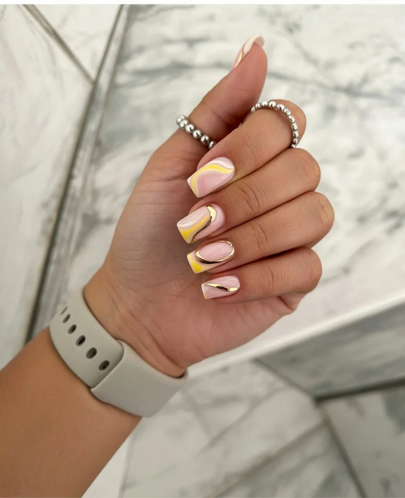
The base starts sheer, either a barely-there pink or a soft milky white, giving the gold waves a clean, quiet backdrop to stand out against. Using a fine detail brush and a metallic gold gel polish, loose, sweeping curves get painted across the nail, keeping the strokes confident rather than shaky, since any hesitation tends to read as messy instead of intentional. Leaving plenty of the sheer base visible between the waves actually strengthens the design, crowding the nail with too much gold starts to look busy rather than elegant. A glossy top coat seals everything in, giving the metallic waves that reflective, slightly wet shine that makes gold detailing look genuinely rich.
This one pairs beautifully with anything neutral or monochrome, since the gold provides more than enough visual interest without needing help from a busy outfit. I’d save this for dinner reservations, summer weddings, or any evening plans where I want my hands to feel a little dressed up. It’s proof that sometimes less really is more when the details themselves are confident enough to carry the whole look.
Pearly White Art With Quiet European Elegance
This design borrows that same understated European energy mentioned earlier, but leans into pearl finishes instead of botanical detail, using a soft, iridescent white as the entire foundation of the look. Rather than adding pattern or extra color, the shimmer itself becomes the detail, catching light differently depending on the angle your hand happens to be at. It feels quiet and refined, the kind of manicure that doesn’t ask for attention but somehow gets noticed anyway. I keep returning to this one because it manages to feel special without a single added element beyond the polish itself.
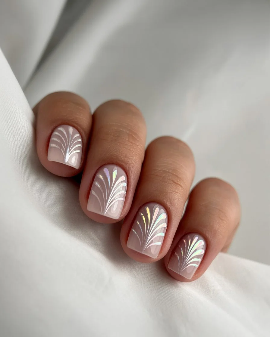
Achieving that soft, pearly finish starts with a semi-sheer white base, built up gradually through thin layers until it reaches a gentle, milky opacity rather than a flat, stark white. Once that’s dry, a pearlescent top coat gets applied, letting fine shimmer particles settle naturally across the nail without any heavy-handed application that would make the sparkle feel obvious or overdone. The whole effect depends on subtlety, so resisting the urge to add extra layers of shimmer actually keeps the finish looking more elegant. A final glossy seal locks everything in, giving the pearl finish a smooth, glowing quality that looks genuinely refined under soft daylight.
I’d wear this with tailored basics, cream trousers, a simple gold watch, anything that leans polished without trying too hard. It works beautifully for professional settings just as easily as it does for a quiet dinner out. This is the kind of design I’d trust to look good in literally any photo, no matter the lighting.
Lavender Ombre Nails That Feel Like Summer Evenings
There’s something inherently romantic about a lavender gradient, the kind of color that feels like the sky right as evening starts settling in. This design blends a pale, almost white lavender near the cuticle into a deeper, more saturated purple toward the tip, creating that soft, dreamy transition ombre nails do so well. It’s gentle without feeling boring, since the gradient itself keeps the eye moving across the nail rather than settling on one flat shade. I find myself drawn to this one specifically on nights I want my nails to feel a little quieter than the loud neons dominating most of my other favorites.
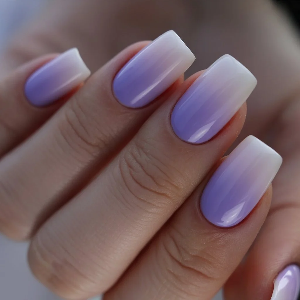
Building this fade starts with a white or very pale lavender base, giving the deeper purple tones something bright to build against as the color intensifies toward the tip. A makeup sponge works best here, dabbing the deeper lavender gradually starting from the middle and building more heavily toward the edge, blending gently with a clean sponge afterward to soften any harsh lines. Taking your time with the blend really does make the biggest difference, rushing tends to leave a visible seam rather than that smooth, gradual shift the design depends on. A glossy top coat finishes everything off, giving the whole gradient a soft, radiant shine that looks especially pretty under warm evening light.
I’d pair this with flowy dresses and delicate silver jewelry, letting the gradient feel like a natural extension of a softer, more romantic outfit. It’s a great choice for dinner dates, garden parties, or really any evening plans where a gentle, dreamy manicure feels right. This is one of those designs that photographs just as beautifully in person as it does in a saved Pinterest pin.
Soft Pink Lines With Delicate Summer Sparkle
This design keeps most of the nail bare, just a sheer, barely-there pink base, then adds a few thin lines in a slightly deeper pink mixed with fine glitter for texture. It’s minimal at first glance, but that little bit of sparkle running through the lines gives it just enough personality to feel intentional. Nothing about it feels overdone, the whole point is restraint paired with a small, glittery surprise. I love designs like this because they photograph as simple but somehow still catch the eye in person.
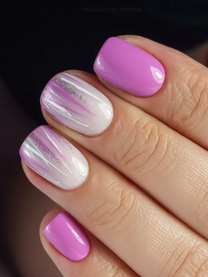
The base starts sheer, a soft pink built up in two thin coats to keep things light and natural rather than fully opaque. Once dry, a fine detail brush comes in for a couple of deliberate lines using a slightly richer pink polish, and once those set, a second pass with glitter polish traces over select lines for added shimmer. Keeping the glitter concentrated only on certain lines rather than the whole nail is what keeps this feeling delicate instead of busy. A glossy top coat locks everything in, giving the sparkle a smooth, comfortable finish that won’t catch on fabric.
This one pairs beautifully with breezy summer outfits and simple gold jewelry, letting the sparkle feel like a natural, quiet extension of an otherwise soft look. It’s become one of my go-to picks for everyday manicures, since it never feels like too much no matter what I’ve got planned. I’d reach for this on days I want my hands to look put-together without spending much time thinking about it. Honestly, it’s the kind of design that works whether I’m running errands or heading somewhere slightly nicer. Simple as it is, it never actually feels boring once it’s finished.
Sunny Yellow Animal Print For Endless Summer Days
Yellow and animal print might not be the first pairing that comes to mind, but this combination genuinely surprised me with how well it works. A bright, cheerful yellow base gets a few small leopard spots added on one or two accent nails, keeping the overall mood playful rather than fierce. It balances happy and a little wild at the same time, which somehow feels perfectly suited for those long, unstructured summer days. I keep thinking about this one because it doesn’t take itself too seriously.
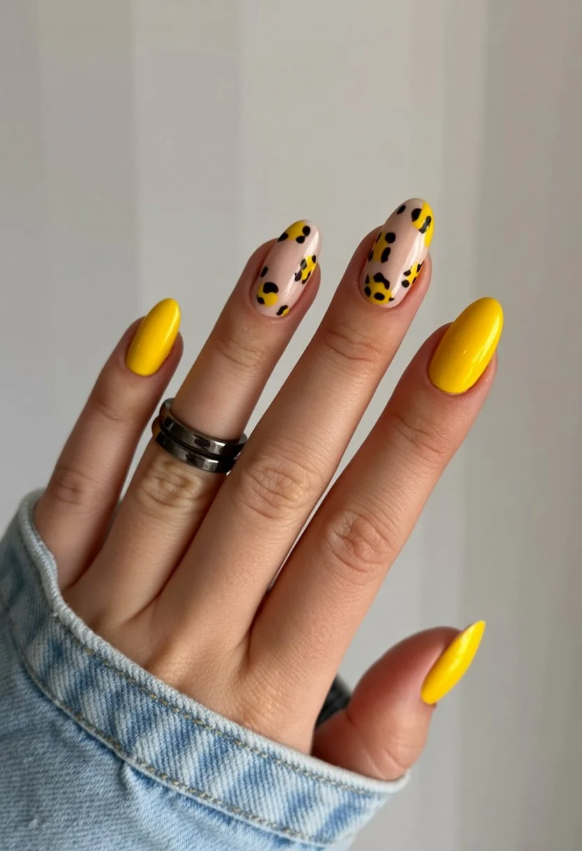
The base needs two to three coats of a fully opaque yellow to reach that clean, saturated color without any streakiness showing through. On the accent nails, small black spots get painted using a fine detail brush, keeping the shapes irregular in size so the print reads as genuine leopard rather than something stamped and uniform. Spacing them a little unevenly actually helps sell the effect, too symmetrical starts looking artificial. A glossy top coat finishes everything, tying the solid yellow and printed accents together with one consistent shine.
I’d wear this to basically any casual summer hangout, pool days, cookouts, road trips, since the color feels fun without needing a special occasion to justify it. It pairs easily with denim, white sneakers, or pretty much any laid-back outfit that doesn’t take itself too seriously either. This is one of those designs that makes me smile a little every time I catch a glimpse of my hands. It’s fun without trying too hard, which is exactly why I keep coming back to it. Definitely one I’ll be requesting again before summer wraps up.
Hot Pink Leopard Nails With Main Character Energy
Leopard print gets a serious mood boost in this design, trading the usual tan and brown palette for a fully saturated hot pink base underneath classic black spots. It’s fierce in a way that still feels playful rather than intimidating, the kind of manicure that makes you want to walk a little differently for the rest of the day. There’s nothing subtle about this pairing, and honestly that’s exactly the appeal, some days call for nails that match a bigger, more confident energy. I keep saving this one specifically for whenever I need a little extra swagger.
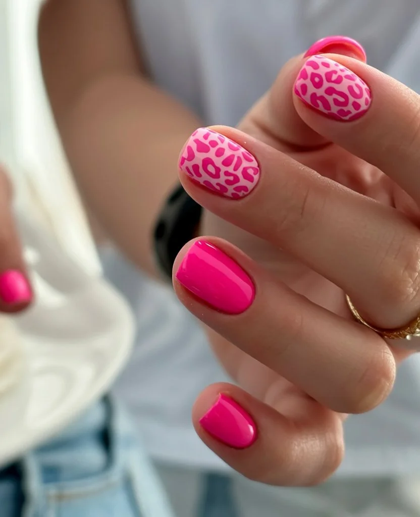
The base needs two to three coats of a rich, fully opaque hot pink, letting each layer dry completely to avoid any streaking or patchy spots showing through. Once that’s set, black spots get painted on using a fine detail brush, keeping the shapes irregular and slightly varied in size so the pattern reads as genuine leopard rather than something stiff and repetitive. Clustering a few spots closer together while leaving other areas more open actually helps the whole thing look more natural instead of mechanically even. A glossy top coat finishes the design, giving both the pink base and black spots a smooth, vibrant shine that makes the whole combination pop.
I’d pair this with black outfits or denim, letting the print and color carry all the visual weight without competing against anything busy. It works especially well for concerts, girls’ nights, or any occasion where you want your hands to feel like part of the outfit’s confidence. This is a design I reach for whenever I want people to actually notice my nails without me having to point them out. It’s bold, a little fun, and never takes itself too seriously despite how fierce it looks. Definitely one of my most requested designs once summer nights start picking up.
Mint French Tip Nails With Quiet Luxury Summer Style
This design takes the mint French tip mentioned earlier and dials it back even further, pairing that same pale mint edge with an incredibly soft, sheer base for something that feels genuinely refined. Instead of a fully opaque nude underneath, the base here stays barely-there, letting the natural nail show through just slightly for a quieter, more polished effect. It reads as expensive without trying very hard, the kind of manicure that whispers rather than shouts. I love how something this simple in concept ends up looking so intentional once it’s finished.
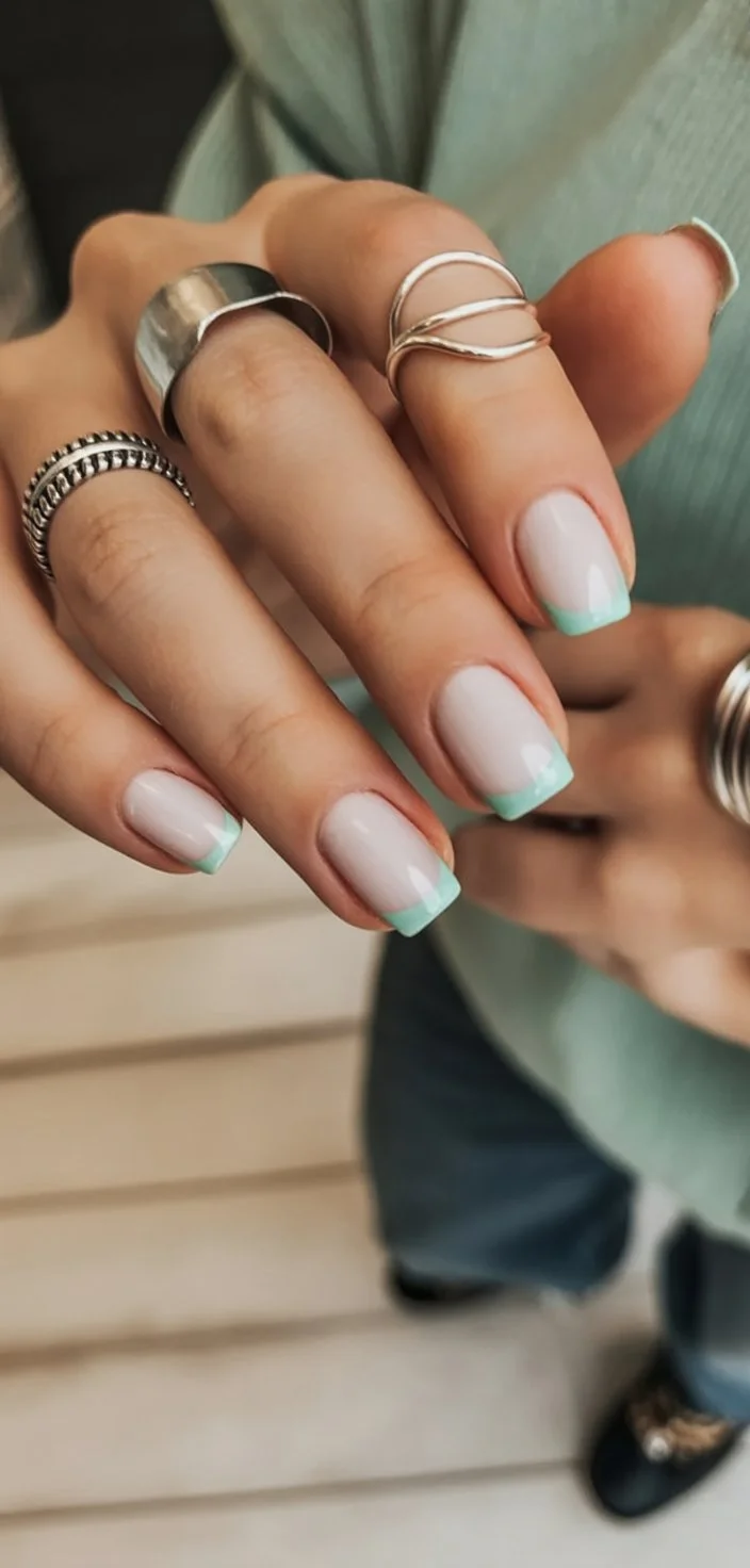
The base starts with a sheer, almost translucent polish, built up in just one or two thin layers to keep that natural, barely-there quality intact. At the tip, a pale, muted mint gets applied in smooth, controlled strokes, and because the rest of the nail stays so quiet, getting that tip line clean really does matter more than usual. Guide stickers help keep the curve consistent, though a steady hand with a thin brush works just as well with a little practice. A glossy top coat finishes everything, giving the mint tip a soft, refined shine that never feels flashy or overdone.
I’d wear this with tailored pieces, linen trousers, a simple gold watch, anything that leans polished without looking like it took much effort. It works beautifully for professional settings and dressier summer evenings alike, since the quiet color palette adapts to almost any occasion. This is one of those designs I trust completely for important meetings or dinners where I want my hands looking put-together. It never competes with an outfit, it just quietly complements whatever else is going on. Definitely a favorite for anyone drawn to that understated, quality-over-quantity approach to style.
Neon Edge Minimalism With A Y2K Twist
This design pulls straight from early 2000s nail trends, using a thin, precise line of neon color along just the very edge of an otherwise bare or lightly tinted nail. It’s minimal in coverage but maximal in nostalgia, bringing back that specific Y2K energy without going full glitter or chrome the way a lot of throwback designs tend to. The neon edge keeps things feeling current, while the overall restraint makes it wearable in a way full neon nails sometimes aren’t. I keep coming back to this one because it manages to feel both retro and completely fresh at the same time.
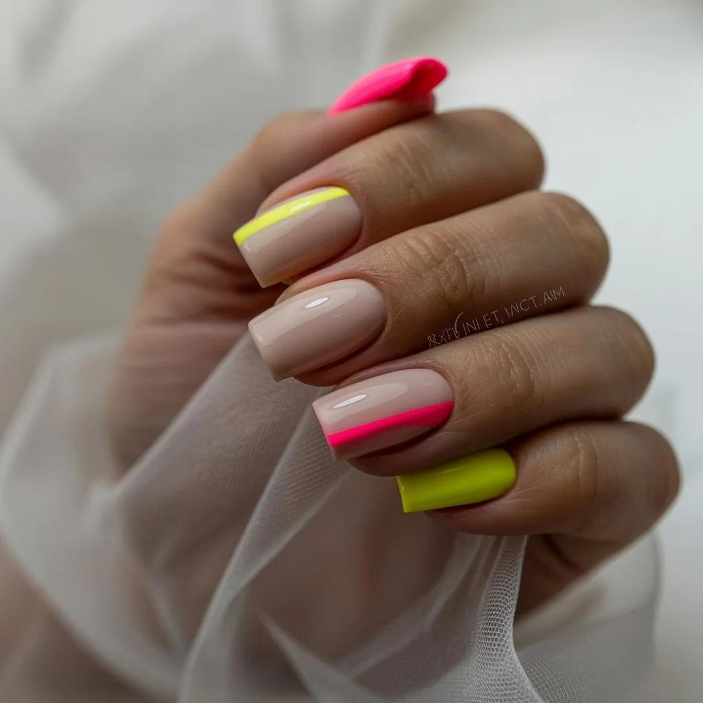
The base stays clean, either bare or covered in a sheer, barely-there polish, giving the neon edge plenty of contrast to stand out against once it’s added. Using a fine detail brush, a thin, precise line of neon pink or lime green gets painted along just the very tip edge of the nail, keeping the line narrow and consistent across every finger. This thinness is really what sells the minimal aesthetic, anything thicker starts looking more like a bold French tip than a subtle Y2K nod. A glossy top coat finishes things off, giving the neon edge a smooth, vibrant shine that keeps the whole look feeling sharp and intentional.
I’d pair this with low-rise jeans and a simple tank, honestly leaning fully into that early 2000s aesthetic the design is already referencing. It works well for casual hangouts, concerts, or anywhere a bit of nostalgic energy feels fitting without going overboard. This is a fun one for anyone who grew up during that era and wants a small, wearable nod to it. It’s subtle enough for daily wear but still carries enough personality to feel like an actual choice. Definitely a design I’ll keep coming back to whenever I want something a little different from typical summer nail trends.
Blue Chrome Nails With Future Summer Energy
This design skips color complexity entirely, relying on a fully reflective blue chrome finish to do all the visual work on its own. There’s no pattern, no added detail, just a smooth, mirror-like blue that shifts between silver and deep cobalt depending on how the light hits it. It feels sleek and a little futuristic, the kind of manicure that looks like it belongs somewhere much more polished than everyday errands. I keep gravitating toward chrome finishes lately because they photograph so differently depending on lighting, which somehow makes them feel new every time I glance down.
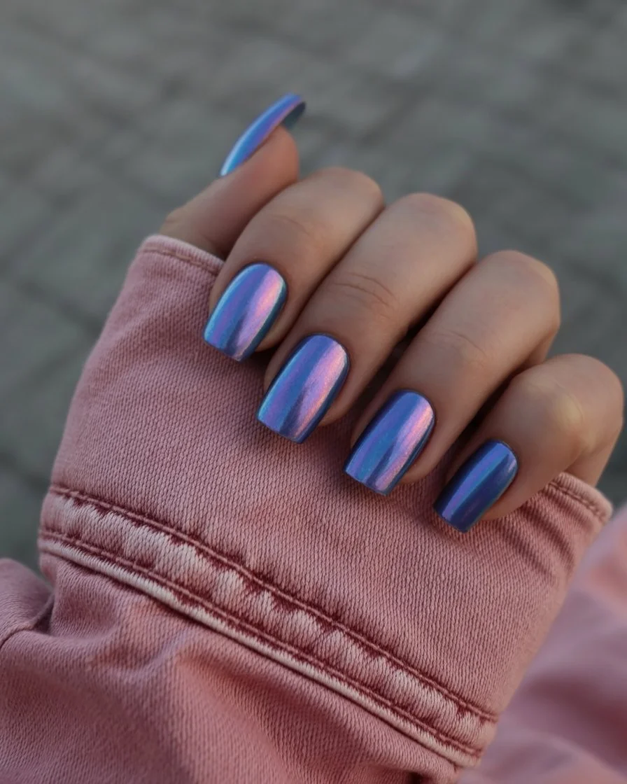
Getting that flawless mirror finish starts with a smooth, medium blue base, built up in two to three coats to reach full opacity without any streaking showing underneath. Once that’s cured, chrome powder gets buffed on using a small sponge applicator, working in careful circular motions until the whole nail develops that reflective, glass-like shine chrome is known for. This buffing step really does require patience, rushing it tends to leave patchy spots instead of that flawless, all-over reflection the design depends on. A glossy sealing top coat locks everything in afterward, protecting the shine while keeping it smooth and resistant to scratching.
I’d pair this with sleek, minimal outfits and simple silver jewelry that lets the chrome finish feel like the actual statement piece. It works beautifully for nights out, creative events, or anywhere I want my nails to feel a little more modern than the usual solid color choices. This is a design that genuinely surprises people once they see how much it shifts under different lighting. It’s bold without needing any color intensity to back it up. Definitely one I’ll be requesting again before summer wraps up completely.
European Pastel Color Blocking That Feels Effortless
This design borrows that same quiet European sensibility mentioned earlier, but leans into color blocking instead of botanical detail, pairing two or three soft pastel shades across different nails rather than mixing them together. Each nail stays a clean, solid color, no gradient, no pattern, just confident blocks of muted pink, sage, and pale blue sitting next to each other. It reads as intentional without trying too hard, the kind of manicure that looks like it took way more thought than it actually did. I love how something this simple in execution can still feel so put-together once it’s finished.
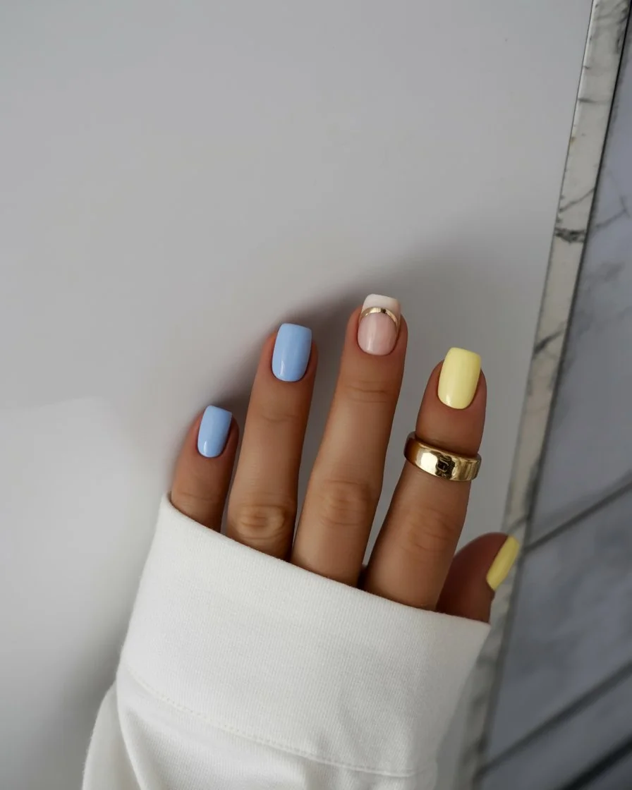
Choosing which pastel goes on which nail matters more than it seems, alternating the colors across the hand usually looks more balanced than grouping similar shades together. Each nail gets two to three coats of its designated pastel, letting every layer dry fully before adding the next so nothing streaks or drags. Because these shades sit so close together in tone, keeping the application clean really does matter, any unevenness tends to stand out more against colors this soft and quiet. A glossy top coat finishes everything, tying the different pastels together with one consistent, polished shine across the whole set.
I’d wear this with neutral linen pieces, letting the color blocking feel like the only real personality in an otherwise simple outfit. It works beautifully for daytime plans, brunch, casual meetings, anywhere a soft but intentional manicure feels right. This is one of those designs that photographs just as well in natural light as it does under any indoor lighting. It never feels boring despite how simple the actual technique is. Definitely a design I’ll keep returning to whenever I want something quietly stylish without much fuss.
Pastel Rainbow Square Nails For Soft Summer Days
This design takes the idea of rainbow nails and softens it considerably, using gentle pastel versions of pink, lavender, mint, and baby blue across different nails instead of anything bold or saturated. Each nail carries its own solid pastel shade, creating a rainbow effect that feels dreamy and light rather than loud or overwhelming. It’s colorful without ever feeling like too much, striking that balance between playful and genuinely wearable. I keep coming back to this one because it somehow works for practically any mood I’m in.
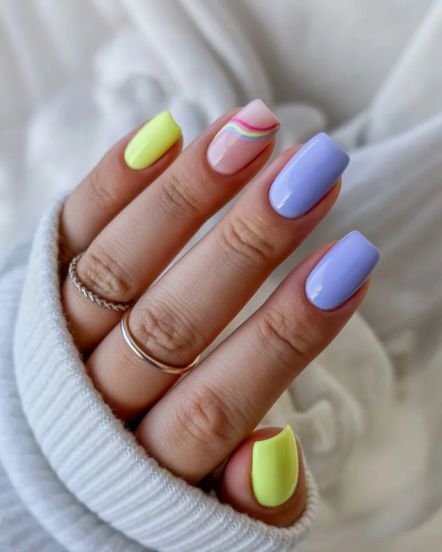
Getting each pastel to full opacity takes about the same approach across every color, two to three thin coats, letting each layer dry completely before moving to the next nail. Deciding how to order the colors across the hand actually matters a bit, alternating warm and cool pastels tends to look more balanced than clustering similar tones together. Keeping the application clean matters quite a bit here too, since lighter shades tend to show any streakiness more obviously than bolder, more saturated colors would. A glossy top coat ties the whole rainbow together at the end, giving every pastel shade the same consistent, polished shine.
I’d pair this with simple white or cream outfits, letting the pastel rainbow feel like the main pop of color in the whole look. It works beautifully for birthday celebrations, summer brunches, or really any occasion that calls for something fun but still easy to wear. This is a design I keep saving because it photographs beautifully without needing perfect lighting to look good. It’s playful in a way that never actually feels childish. Definitely one of my favorite ways to wear color without committing to just one single shade.
Long Ombre Nails With Neon Glow Details
This design takes a longer square shape and pairs it with a smooth color gradient, then adds a few tiny neon accents near the tip for an unexpected pop of brightness. The base gradient stays soft, usually blending a pale nude into a warm peach or pink, while small neon dots or a thin line near the edge break up the softness with something bolder. It’s a nice mix of subtle and statement, giving the length room to feel elegant while the neon detail keeps things from feeling too quiet. I love designs like this because they manage to do two completely different moods at once without feeling conflicted.
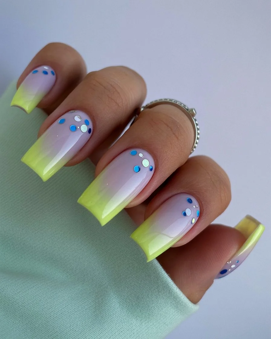
Building the gradient starts with a pale nude base, blending gradually into a warmer peach or pink toward the tip using a makeup sponge and a few gentle dabbing motions to soften the transition. Once that’s fully dry, a fine detail brush comes in for the neon accent, whether that’s a couple of small dots or a thin line traced right along the very edge of the tip. Keeping the neon detail small and controlled is really what makes this design work, too much neon competing with the gradient starts to feel busy rather than intentional. A glossy top coat finishes everything off, giving both the soft gradient and bright neon accent a smooth, unified shine.
I’d pair this with simple, neutral outfits that let the length and the neon pop do all the talking without much competition. It works beautifully for evening events or anywhere I want my nails to feel a little more elevated than a typical daytime manicure. This is one of those designs that photographs beautifully because of how much contrast exists between the soft base and that one bright detail. It never feels like too much despite the neon element being pretty bold on its own. Definitely a design I’ll be requesting the next time I want length and color working together.
Soft Lilac And Neon French Tip Summer Mood
This design pairs a gentle lilac base with a fully saturated neon tip, creating a French manicure that feels both soft and unexpectedly bold at the same time. Instead of a traditional white line, the tip gets painted in something like neon pink or lime, giving the whole classic shape a completely different personality. It’s a fun contradiction, calm and loud existing on the same nail, which somehow ends up looking more interesting than either extreme on its own. I keep thinking about this one because it feels like a genuinely fresh take on a shape everyone’s seen a thousand times before.
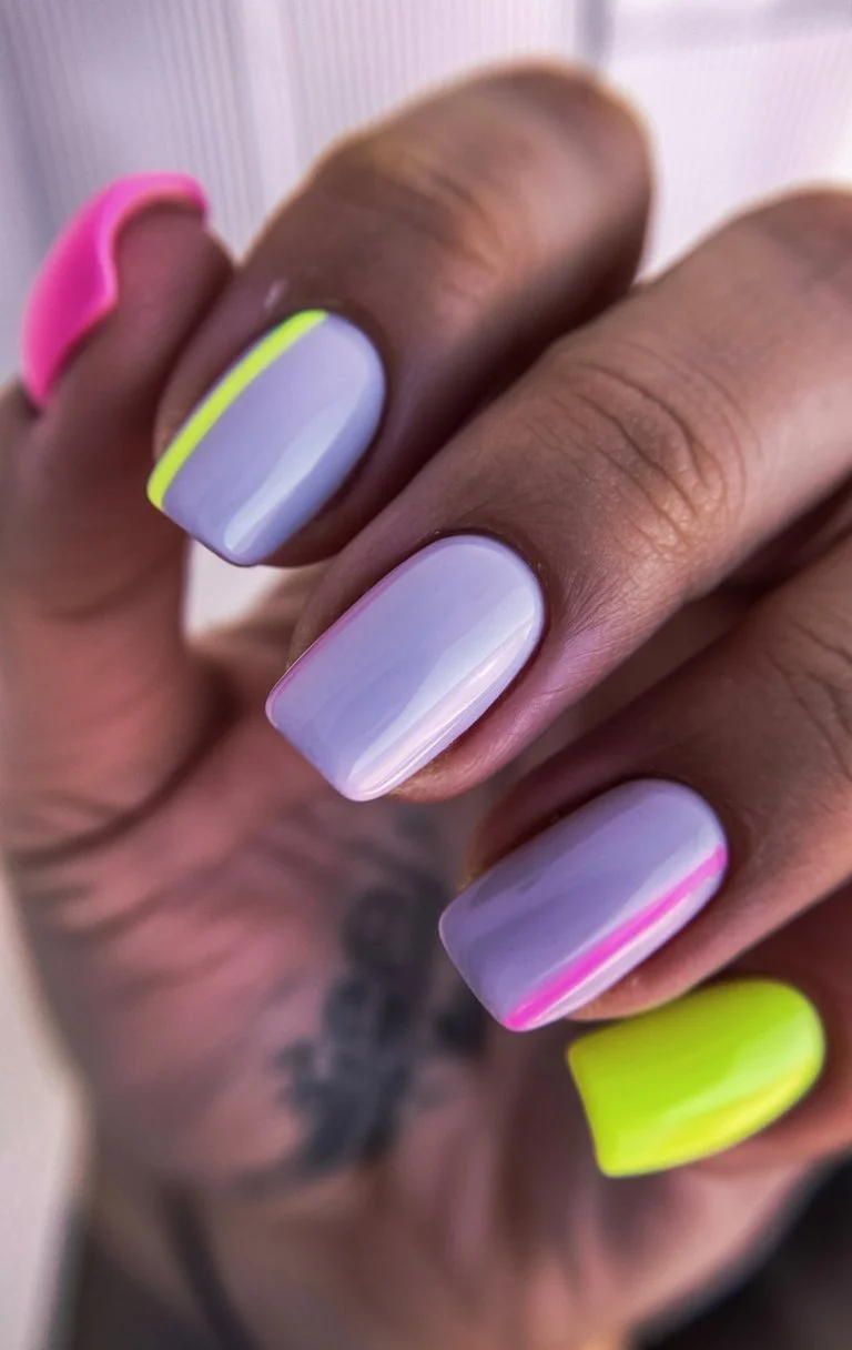
The base starts with a soft, opaque lilac painted across the entire nail, chosen specifically because its gentleness makes the neon tip pop even harder once it’s added. At the tip, a fully saturated neon shade gets applied in clean, confident strokes, and getting that line crisp really does matter here since the contrast between the two colors leaves no room for sloppy edges. Guide stickers help keep things consistent, though a steady hand with a thin brush works well once you’ve had some practice. A glossy top coat ties both colors together, giving the finished look a smooth, polished shine that makes the contrast feel intentional rather than random.
I’d pair this with playful summer outfits that aren’t afraid of a little color clash themselves, since the nails already embrace that same energy. It works well for casual outings, summer parties, or anywhere a fun, slightly unexpected manicure feels appropriate. This is a design that always gets a second look, mostly because people don’t expect that much neon paired with something so soft. It’s proof that gentle and bold can absolutely coexist on the same nail. Definitely one of my favorite unexpected pairings from this whole list.
Neon Waves Bringing Y2K Back In The Best Way
This design leans fully into that early 2000s energy, using loose, flowing wave lines in bright neon color across an otherwise simple base. Instead of a full, saturated nail, the waves stay confined to a few confident strokes, letting plenty of the base color show through between each one. It captures that specific Y2K nostalgia without feeling like a costume, playful and bright without going overboard. I keep saving this one because it manages to feel both familiar and completely current at the same time.
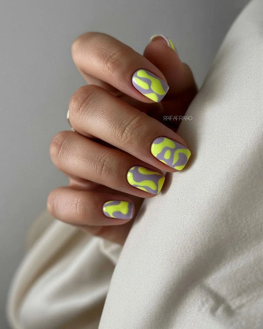
The base starts clean, either bare or covered in a sheer, barely-there polish, giving the neon waves plenty of contrast to stand out against once they’re painted on. Using a fine detail brush, a few loose, flowing wave lines get painted across the nail in a fully saturated neon shade, keeping the strokes confident and slightly varied in thickness so the design feels organic rather than stiff. Leaving generous space between the waves actually strengthens the minimal, nostalgic feel, crowding the nail with too many lines starts looking cluttered instead of intentional. A glossy top coat finishes things off, giving those neon waves a smooth, vibrant shine that makes them pop against the simple background.
I’d pair this with low-rise everything, honestly, since the whole design already leans so hard into that early 2000s aesthetic. It works beautifully for casual hangouts, concerts, or anywhere that nostalgic energy feels like the right fit. This is a fun, easy design for anyone who wants a small nod to that era without committing to anything too literal. It’s simple enough to wear daily but still carries plenty of personality. Definitely one I’ll keep coming back to whenever I want something playful and a little different.
Hot Pink Floral Nails With Weekend Energy
This design pairs a bold hot pink base with small, hand-painted flowers for something that feels cheerful and completely unbothered, exactly the kind of energy I want heading into a weekend. Instead of soft, delicate blooms, the flowers here get painted in bright white or yellow, standing out confidently against that saturated pink background. It’s playful without feeling overly sweet, striking a nice balance between bold color and a touch of detail. I keep gravitating toward this one because it feels like the manicure equivalent of good weekend plans.
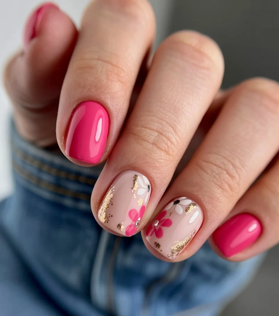
The base needs two to three coats of a fully saturated hot pink to reach that rich, opaque color without any streaking showing through. Once that’s dry, small flowers get hand-painted using a fine detail brush, usually five or six simple petals arranged loosely around a small yellow or white center. Placing the flowers on just one or two accent nails rather than the whole set keeps the design feeling intentional instead of overly busy. A glossy top coat finishes everything off, giving both the bold pink base and the painted florals a smooth, cohesive shine.
I’d wear this with denim shorts and a simple top, letting the nails bring most of the personality to an otherwise casual outfit. It works beautifully for weekend brunches, farmers markets, or really any relaxed daytime plans that call for something fun. This is a design that always makes me feel a little more excited about whatever I’ve got planned. It’s bold but never takes itself too seriously. Definitely one of my go-to picks whenever I want color paired with just a bit of extra charm.
Pearly Glow Square Nails That Feel Like Summer Light
Closing out this whole list with something quiet and glowing, this design uses a soft pearlescent finish over a pale, barely-there base to create nails that genuinely look like they’re catching the last bit of afternoon sun. There’s no color statement here, no bold pattern, just a gentle, shimmering shine that shifts depending on the light around it. It feels calm and a little luminous, the kind of manicure that photographs beautifully without any effort behind the styling. I saved this one for last because it somehow sums up the whole soft, glowing mood I’ve been chasing all summer.
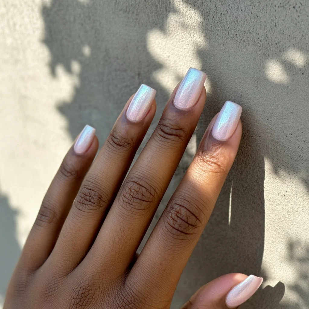
The base starts sheer, a barely-there white or pale pink built up in thin layers until it reaches that soft, milky opacity rather than anything stark or fully opaque. Once that’s dry, a fine pearlescent top coat gets applied, letting delicate shimmer settle naturally across the nail without ever looking heavy-handed or obvious. The whole effect depends on restraint, adding too much shimmer starts to overwhelm that soft, quiet base underneath. A glossy sealing coat finishes things off, giving the pearl finish a smooth, glowing quality that looks genuinely lovely under natural light.
I’d pair this with soft, flowing fabrics and minimal gold jewelry, letting the glow feel like a natural extension of an already gentle outfit. It works beautifully for basically any occasion, weddings, quiet dinners, lazy weekend mornings, since the understated shine never feels out of place. This is the design I keep coming back to when I want my nails to feel effortlessly pretty. It never demands attention, but it always somehow gets it anyway. Definitely the one I’ll be requesting the most as summer starts winding down.
Final Thoughts
Putting this whole list together made one thing pretty clear, square nails genuinely work with almost any mood you’re chasing, whether that’s soft and quiet or loud enough to stop someone mid-scroll. From botanical greens that feel straight out of a European nail account to hot pink leopard print that brings serious main character energy, this roundup covers basically every version of summer I’ve wanted my hands to reflect this season. What I love most is how differently the same clean, flat shape can read depending on color and finish, chrome feels futuristic, pastel color blocking feels effortless, and a simple pearl glow somehow ends up being one of the most requested looks on the whole list. I’ve genuinely screenshotted every single one of these, and I have a feeling my nail tech is going to see this exact article the next time I sit down in that chair.
If you’ve been scrolling through nail inspo without ever actually booking anything, let this be the push you needed. Pick whichever design matches your mood right now, whether that’s something quiet and refined or fully committed to neon and Y2K nostalgia, and don’t be afraid to mix a couple of these ideas together if nothing on its own feels quite right. None of these are meant to be copied exactly, they’re just a starting point for whatever version of square nails actually feels like you. Whatever you end up choosing, I hope your next manicure feels as good to look at as it does to finally follow through on. This is definitely the summer I’m actually using my saved folder instead of just adding to it.


